Beautiful Design for Everyone

This is an abridged text version (more or less) of the talk I gave at the London Web Standards meetup in May which I always intended to write up, but between work and planning a wedding, kind of fell by the wayside. There were 49 slides and because my friend and fellow speaker Antonia Hyde had to pull out I expanded the talk beyond its original time slot of 45 minutes so while I've tried to be as concise as possible in the notes accompanying each slide, you might want to grab yourself a cup of tea (or other beverage of choice) before you start reading.

So, if you're sitting comfortably, let's begin.

Beautiful Design for Everyone

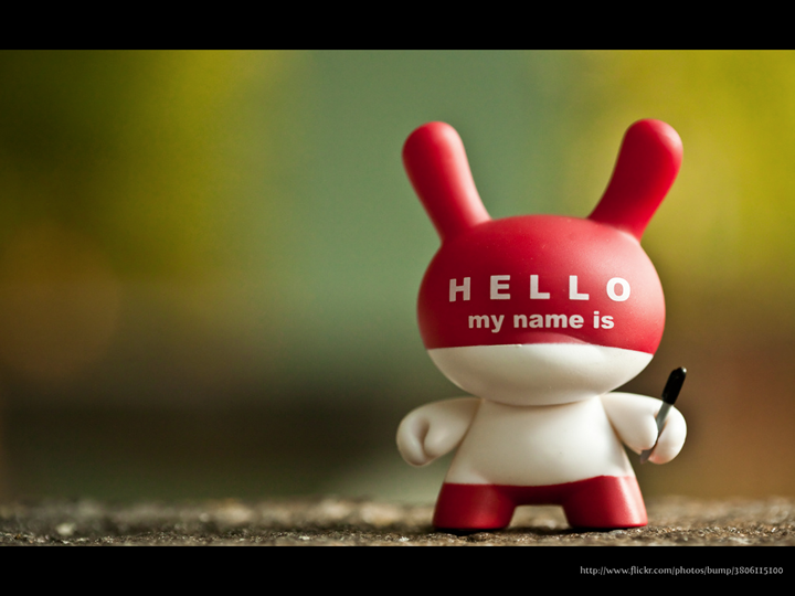
Hello, My Name is Ann and I'm a recovering Accessibility Consultant.

Over the years I've talked about accessibility a lot, and I used to tell people that I had a passion for accessibility, and I really believed it. When I found myself working at RNIB and discovered that I could get paid for talking about this passion, I thought that it was my dream job. For a while, it really was. I did then, and still do, get a buzz from seeing careful design empower someone who has been been experiencing difficulty in a particular area, but what it made me realise over the years was that it wasn't accessibility I was passionate about, it was good design.

To me, good design is inclusive.

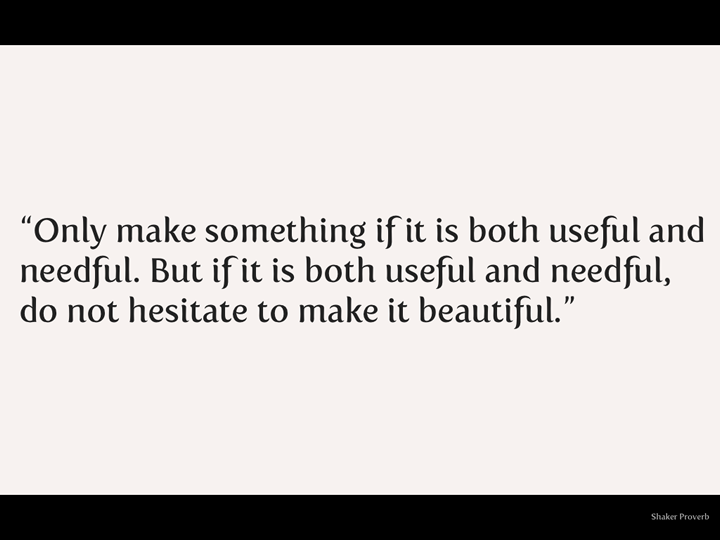
There's a famous Shaker Proverb that I love. It says:

"Only make something if it is both useful and needful. But if it is both useful and needful, do not hesitate to make it beautiful."

This, more than any form of words I've yet been able to come up with, encapsulates my design philosophy. After all, beautiful things make people happy. Useful, needful, beautiful things most often come about as a result of careful thought, understanding and skill from people who care about solving problems, not from ticking boxes on a checklist. That's why it's called design, not manufacture.

Raise your hand (mentally if you're in a public place and don't want people to stare at you) if you think of accessibility as being beautiful.

Did you raise your hand? Even in your head?

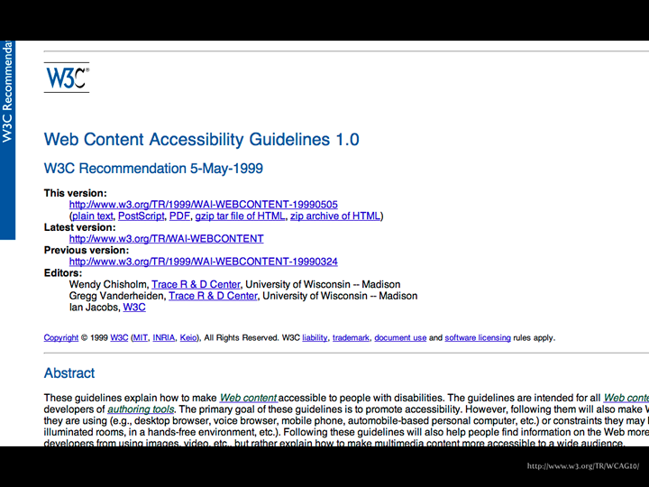
Did you think of things like the W3C Web Content Accessibility Guidelines?

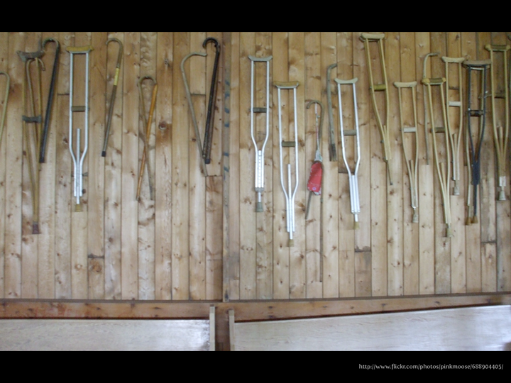
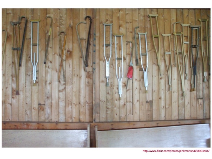
Or maybe assistive items like crutches?

That's ok.

Raise your hand if you're a designer (or a developer) and feel constrained by having to "do" accessibility. Or if you fear that "doing" accessibility will make your work or the experience you are creating lowest common denominator, boring or ugly for everyone else.

Don't worry, there's no judgement here. You can be honest.

So what's the problem?

The problem with accessibility is that when you start thinking about it, it's only natural to start thinking about disability, and that can be uncomfortable.

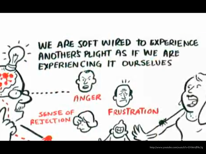
That's not a bad thing and it doesn't make you a bad person. In fact, it's perfectly natural. You can't help it. It's called empathy and it turns out that we are an empathic civilisation (this is an awesome video, do make a note to watch it when you're done reading, or open it in a new tab now so it will have done buffering and be ready when you are).

We are soft wired to experience another's plight as if we are experiencing it ourselves.

It's ok to empathise, but all too often I've seen people get so caught up in their empathy that it has lead them off the path to understanding the real needs of the user and prevented them from solving the problem at hand.

I can still remember the first time I saw a blind person using a screen reader. I'm pretty sure my mouth dropped open in astonishment and my only thoughts were what a horrible experience it was which lead to thinking about what it might like to be blind, which led to me feeling uncomfortable as I felt sorry for anyone who was blind because I couldn't imagine how I would cope and how I would put up with this awful experience and simultaneously felt glad that I had my sight. This was closely followed by feeling ashamed of myself for feeling like that.

What I didn't understand that first time (or second, third, fourth or probably fifteenth) was that not only had I failed to see that they had developed expert skills and could process auditory information far faster than I could ever hope to, but that while this expert skill gave them the freedom that I, in my naiveté had assumed would be lost.

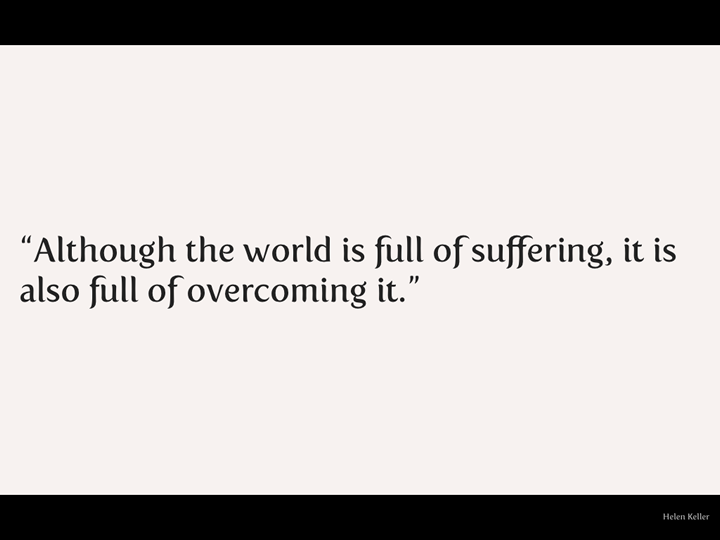
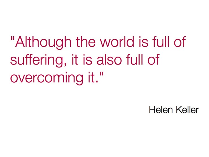
Helen Keller, who was deaf and blind, said:

"Although the world is full of suffering, it is also full of overcoming it."

Humans are incredibly adaptive. Yes, having a disability (if I use the medical model of disability, which describes disability as "a sociopolitical model by which illness or disability, being the result of a physical condition, and which is intrinsic to the individual (it is part of that individual’s own body), may reduce the individual's quality of life, and causes clear disadvantages to the individual.") can be painful and frustrating, but people with disabilities don't just sit around feeling sorry for themselves waiting for someone to come along and help them, and actually, that's a pretty crappy way to think of it. Whereas the social model of disability, which "identifies systemic barriers, negative attitudes and exclusion by society (purposely or inadvertently) that mean society is the main contributory factor in disabling people. While physical, sensory, intellectual, or psychological variations, may cause individual functional limitation or impairments, these do not have to lead to disability unless society fails to take account of and include people regardless of their individual differences" is more likely to be the case.

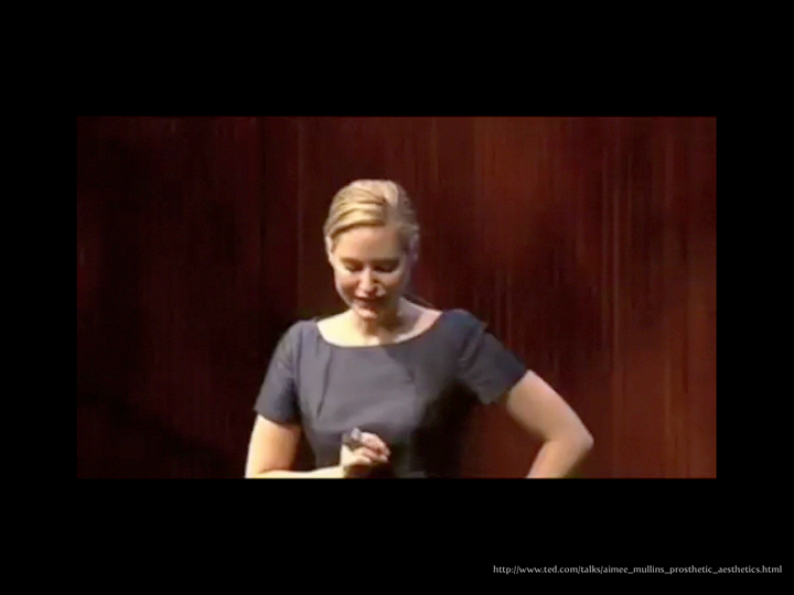
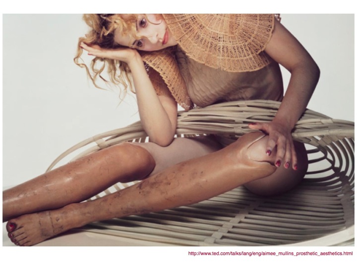
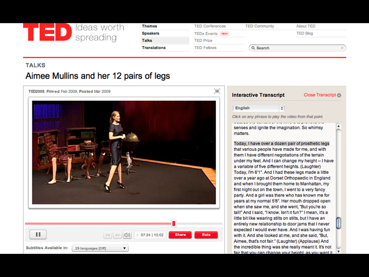
Aimee Mullins is an inspiration to me. If you don't know who she is, you're in for a treat. I could write paragraphs about her but it's going to be much more effective if you experience it for yourself.

I've embedded the video here for ease of use, but if you prefer to read the transcript, it's below the video (or you can watch Aimee Mullins and her 12 pairs of legs on TED.com). It's ten minutes long. You can stop watching (if you want to) after four and a half minutes, because that's the clip that I showed/talked about on the night, but the whole thing is incredible and definitely worth watching.

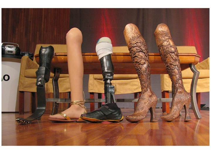
I was speaking to a group of about 300 kids, ages six to eight, at a children's museum, and I brought with me a bag full of legs, similar to the kinds of things you see up here, and had them laid out on a table, for the kids. And, from my experience, you know, kids are naturally curious about what they don't know, or don't understand, or what is foreign to them. They only learn to be frightened of those differences when an adult influences them to behave that way, and maybe censors that natural curiosity, or you know, reins in the question-asking in the hopes of them being polite little kids. So, I just pictured a first grade teacher out in the lobby with these unruly kids, saying, "Now, whatever you do, don't stare at her legs."

But, of course, that's the point. That's why I was there, I wanted to invite them to look and explore. So I made a deal with the adults that the kids could come in, without any adults, for two minutes, on their own. The doors open, the kids descend on this table of legs, and they are poking and prodding, and they're wiggling toes, and they're trying to put their full weight on the sprinting leg to see what happens with that. And I said, "Kids, really quickly -- I woke up this morning, I decided I wanted to be able to jump over a house -- nothing too big, two or three stories -- but, if you could think of any animal, any superhero, any cartoon character, anything you can dream up right now, what kind of legs would you build me?"

And immediately a voice shouted, "Kangaroo!" "No, no, no! Should be a frog!" "No. It should be Go Go Gadget!" "No, no, no! It should be The Incredibles." And other things that I don't -- aren't familiar with. And then, one eight-year-old said, "Hey, why wouldn't you want to fly too?" And the whole room, including me, was like, "Yeah." (Laughter) And just like that, I went from being a woman that these kids would have been trained to see as "disabled" to somebody that had potential that their bodies didn't have yet. Somebody that might even be super-abled. Interesting.

So some of you actually saw me at TED, 11 years ago, and there's been a lot of talk about how life-changing this conference is for both speakers and attendees, and I am no exception. TED literally was the launch pad to the next decade of my life's exploration. At the time, the legs I presented were groundbreaking in prosthetics. I had woven carbon fiber sprinting legs modeled after the hind leg of a cheetah, which you may have seen on stage yesterday. And also these very life-like, intrinsically painted silicone legs.

So at the time, it was my opportunity to put a call out to innovators outside the traditional medical prosthetic community to come bring their talent to the science and to the art of building legs. So that we can stop compartmentalizing form, function and aesthetic, and assigning them different values. Well, lucky for me, a lot of people answered that call. And the journey started, funny enough, with a TED conference attendee -- Chee Pearlman, who hopefully is in the audience somewhere today. She was the editor then of a magazine called ID, and she gave me a cover story.

This started an incredible journey. Curious encounters were happening to me at the time; I'd been accepting numerous invitations to speak on the design of the cheetah legs around the world. People would come up to me after the conference, after my talk, men and women. And the conversation would go something like this, "You know Aimee, you're very attractive. You don't look disabled." (Laughter) I thought, "Well, that's amazing, because I don't feel disabled." And it really opened my eyes to this conversation that could be explored, about beauty. What does a beautiful woman have to look like? What is a sexy body? And interestingly, from an identity standpoint, what does it mean to have a disability? I mean, people -- Pamela Anderson has more prosthetic in her body than I do. Nobody calls her disabled. (Laughter)

Now what?

Well, it's hardly fair of me to talk about problems without talking about solutions, but this isn't going to be a regurgitation of the WCAG guidelines, because, let's face it, guidelines and tedious. They're a great reference but not really the first (or fiftieth) thing you're likely to turn to if you're looking for some inspiration.

What I want to share is not so much about specific techniques, because although some of them are useful, technology changes so fast that they're likely to be out of date pretty soon, so I'd much rather talk about a loose framework of things to keep in mind. Go some way towards teaching you to fish rather than give you a fish, if you will.

I've broken this loose framework into four areas: Structure, Alternatives, Flexibility and Equivalents, and first up is:

Structure

This is fundamental.

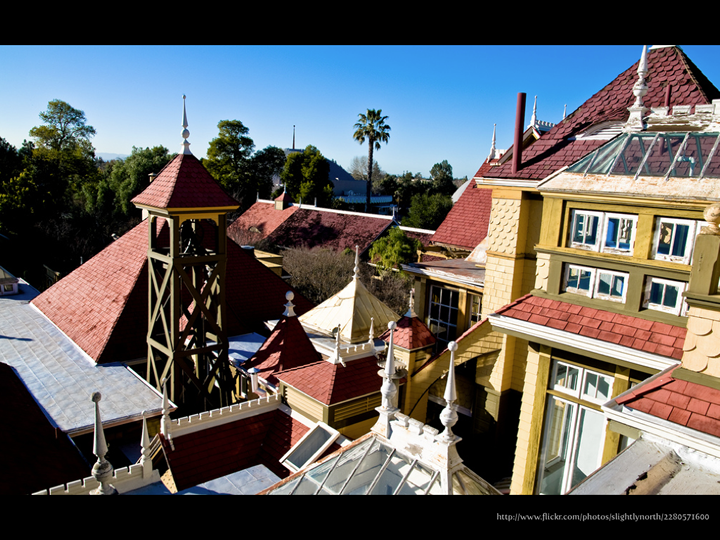
This is the Winchester Mystery House, which I learned about from Peter Morville, who talked about it in his presentation on Search Patterns at UX London.

Some stats about the house:

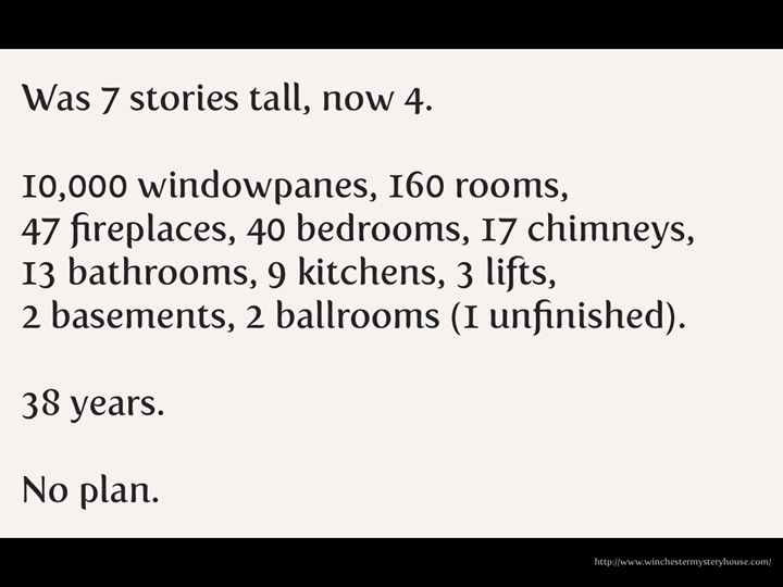
Was 7 stories tall, now 4.

10,000 windowpanes, 160 rooms, 47 fireplaces, 40 bedrooms, 17 chimneys, 13 bathrooms, 9 kitchens, 3 lifts, 2 basements, 2 ballrooms (1 unfinished).

38 years.

No plan.

The poor woman who built the house had been told that if she stopped building the house that she'd die, so she kept on going. It's apparently nigh on impossible to navigate around, and has doors opening onto brick walls and passages that lead nowhere. All of which is a not particularly subtle metaphor for a website with really bad Information Architecture.

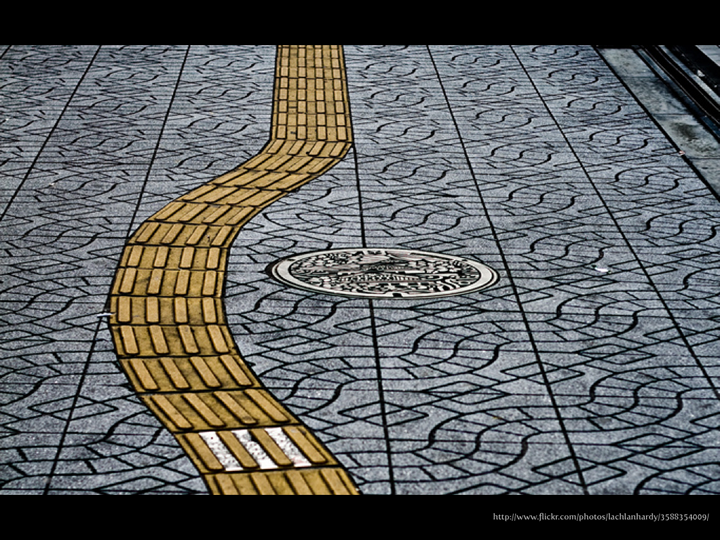
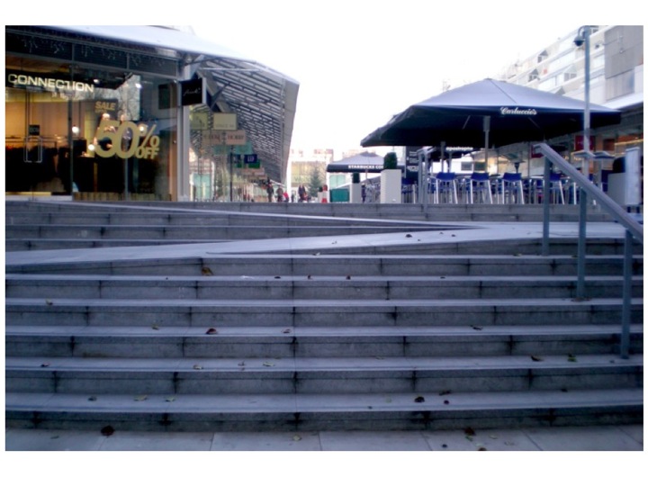
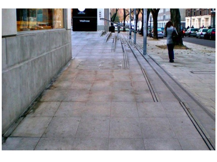
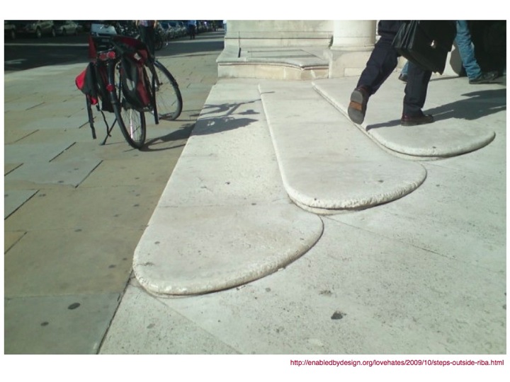
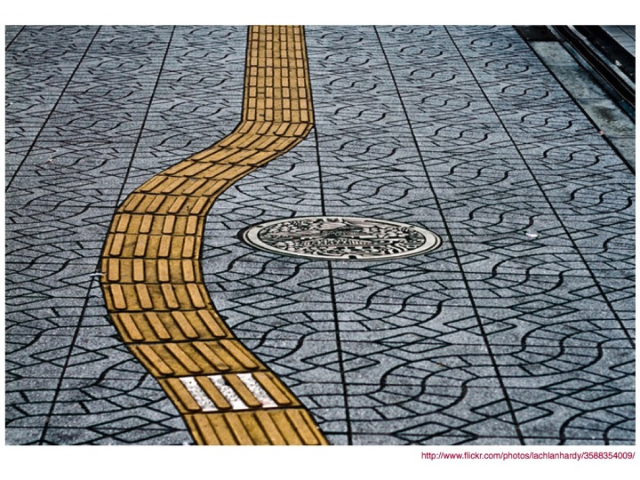
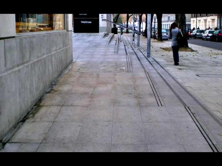
However, even with the best structure possible in place, you might need to put some wayfinding in place, but that's ok, because it doesn't have to be ugly and stick out like a sore thumb. It can be beautiful, like this tactile paving.

It doesn't need to be just for people with disabilities either. I spent a couple of weeks commuting in Bristol before I realised that most bus stops have this type of ramp built into them. I’ve never once in all the time I was there (or have been there since) seen anyone in a wheelchair use them, but I've seen loads of parents with buggies use them, and I'm sure they were grateful for them.

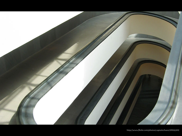
And I'm sure the people walking around the Vatican don't complain about having to use this beautiful ramp either.

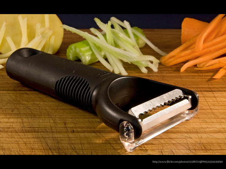
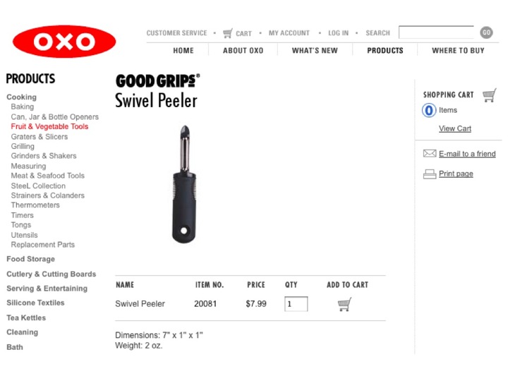
This is the OXO Good Grips Julienne Peeler. I don't know if you've heard of the range or even own any of the items from it. Did you know that they were originally designed for a woman with arthritis? Would it have made a difference to your purchasing decision if you'd known before? Will/would it make a difference now?

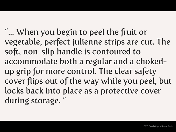
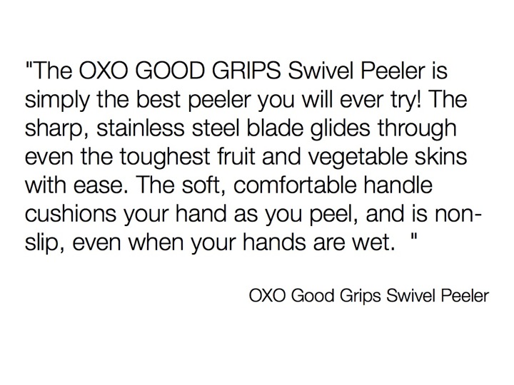
An example of the copy from the OXO Good Grips website about the Julienne Peeler:

"… When you begin to peel the fruit or vegetable, perfect julienne strips are cut. The soft, non-slip handle is contoured to accommodate both a regular and a choked-up grip for more control. The clear safety cover flips out of the way while you peel, but locks back into place as a protective cover during storage."

Do you see any reference to disability in their copy?

Neither did I. They emphasised the ease of use which yes, benefits people with arthritis or other mobility difficulties, but don't limit its usefulness to just that user group. As a result, it's become incredibly successful as a brand, and so it should.

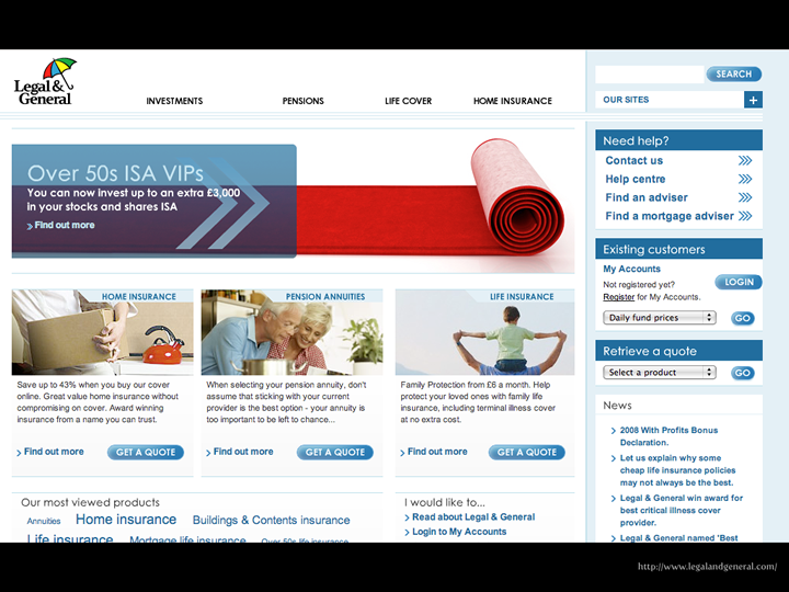
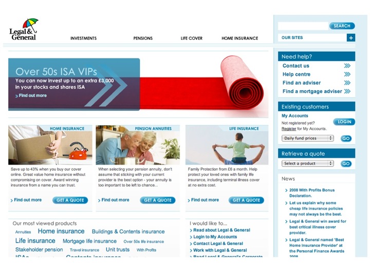
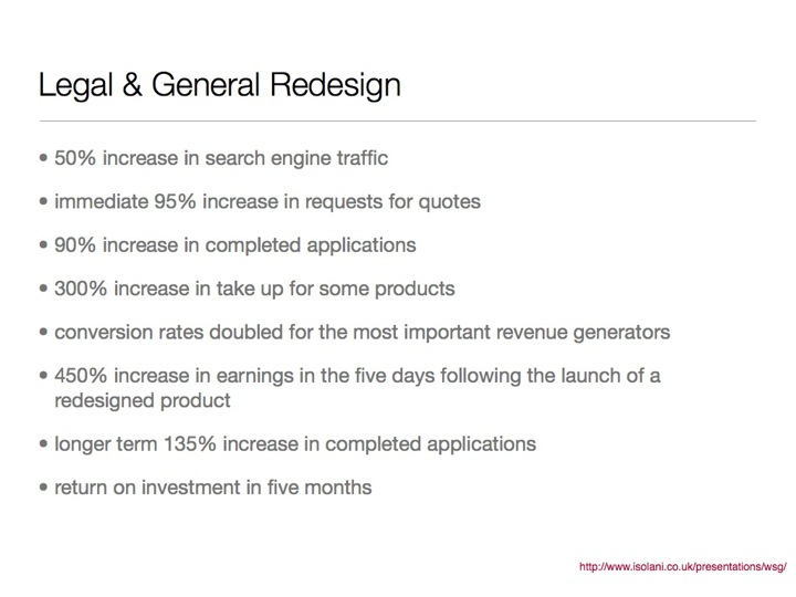
The Legal and General website underwent a redesign which changed the structure to make it easier to find information, and took it a step further and made it easier to understand the information when you did find it. It was an enormous success. Just a few of the staggering statistics that resulted:

  • 50% increase in search engine traffic
  • immediate 95% increase in requests for quotes
  • 90% increase in completed applications
  • 300% increase in take up for some products
  • conversion rates doubled for the most important revenue generators
  • 450% increase in earnings in the five days following the launch of a redesigned product
  • longer term 135% increase in completed applications
  • return on investment in five months

No, I'm not making it up. More information can be found in Mike Davies’ Presentation to the London Web Standards Group.

It's important to note that these figures were a result of an organic increase in traffic. No additional marketing was done around the time of the relaunch.

The increase in sales as a result of making the site accessible didn’t, for the most part, come from people with disabilities. It came from “normal” people. Making the site easier to use for people with disabilities made it easier to use for everyone, and as a result, more people bought the products.

It's awesome, but I'm incredibly disappointed that we don't have more of these business cases to share.

If you start from a good solid base experience and build on it, you can create something pretty special.

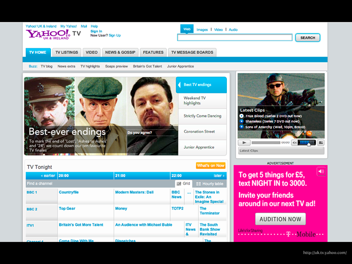
The Yahoo UK & Ireland TV section uses a fairly standard design pattern for its faceted search. It looks pretty. It fits with the rest of the design. So what?

So the magic is under the hood.

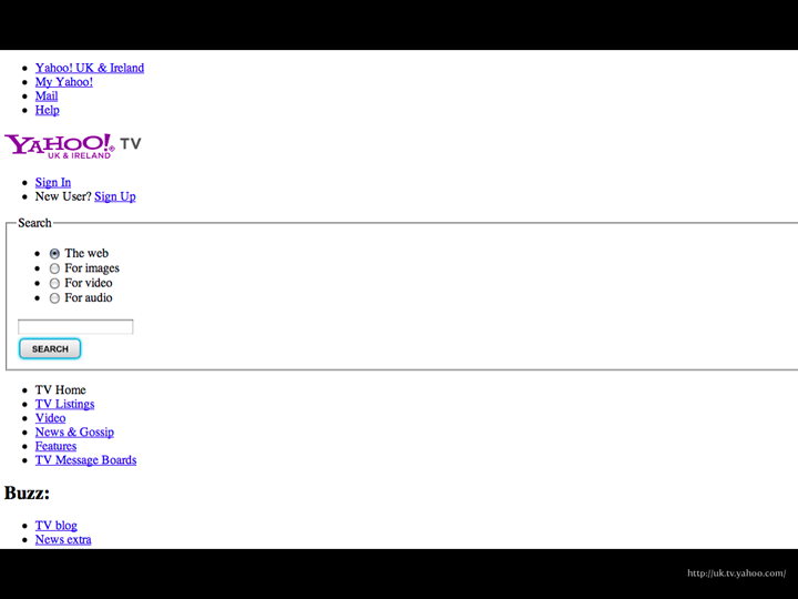
What looked like a standard tabbed search component turns out to be a beautifully designed and built component that uses boring old HTML and CSS to do something rather wonderful, because the developer, Steve Marshall from Yahoo, really thought through the problem and wanted to do something better than what was the current standard approach. I'm amazed this hasn't got more traction by now, since it's more than three years old now.

By using standard form controls and deeply understanding the interaction behaviours that come with those controls, he make something that works beautifully for all users. It's genius.

Which brings me to:

Alternatives

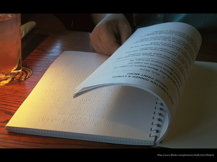
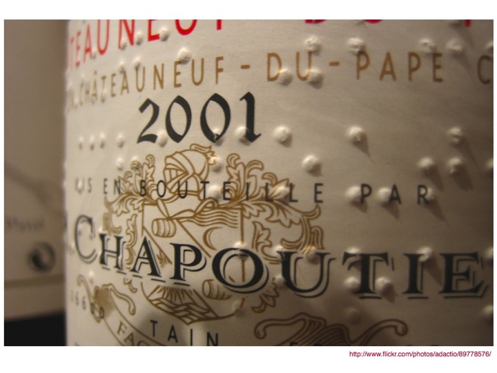
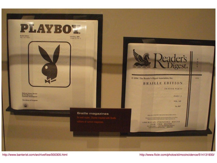
Alternatives don't have to be something hidden. They can be beautiful in their own right. This image shows a restaurant menu that interleaves large print and braille pages and when I found the photo it reminded me of the RNIB Annual Report I saw years ago, which had printed pages interleaved with transparent braille pages. It was able to be read by a broad audience and was a thing of beauty.

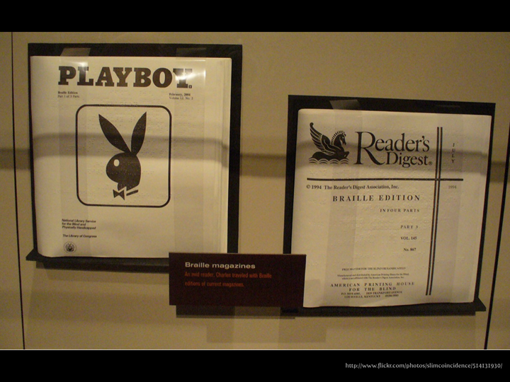
I remember about three months into working at RNIB I had an induction training session and they told us about Braille Playboy. I loved the idea that braille readers could read it "for the articles" too!

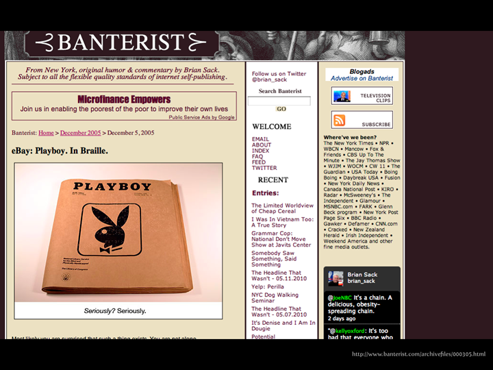
Which leads me to a blog post on Banterist I found when I was searching for images of Braille Playboy and has some of the best captions I've ever seen online. I'm not going to spoil them for you. You'll have to go see for yourself.

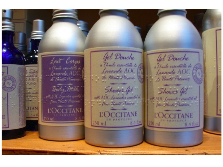
There are Braille/Print Hybrid Labels. I really don't think the presence of braille on this label harms the aesthetics or the information. Do you?

TED.com displays interactive transcripts adjacent to the videos. You can click on the text and it will skip you to the right place in the video. Doesn't get in the way of the experience for someone who doesn't have problems with sound, and actually comes in really handy when you want to skip to a particular place.

Transcripts are one of the few alternatives that are genuinely time consuming to provide, but it doesn't always HAVE to be the content provider doing the transcribing.

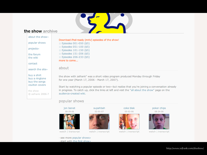
Ze Frank's The Show was the first instance I can ever remember of seeing crowd-sourced transcripts. In his case it wasn't so an audience of disabled people could access them, it was so people who were behind firewalls or couldn't otherwise get at the videos could read the transcripts and so members of the community which developed around the videos raced to help transcribe. Fabulous.

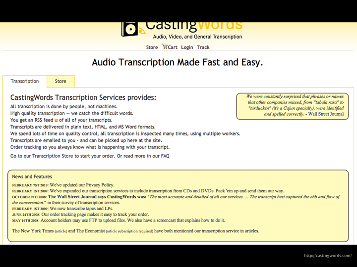
Of course, not everyone has the popularity of Ze Frank, so there are services available online, like Casting Words, where for a few dollars you can get a transcript done for you. It's easy and usually fast, though not necessarily 100% accurate, but it'll get you a lot of the way there.

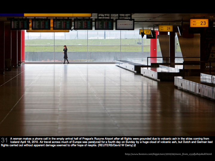
My favourite example of descriptive captions as page content is Boston.com's Big Picture. The alternative adds something for those who can see both, rather than detracting from the image.

Flexibility

Everyone's different. Uses a different machine. Sits in different light. Has varying degrees of hangover/tiredness when they get up each morning.

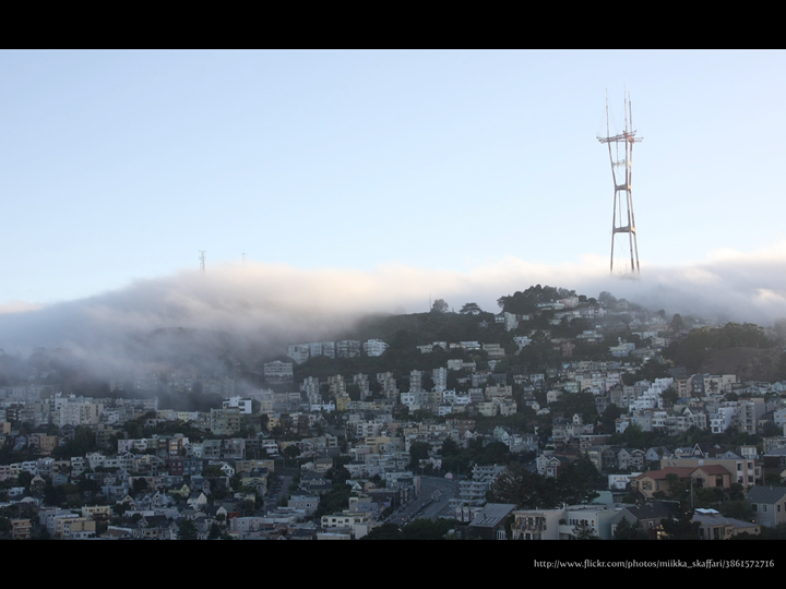
People aren't static. Some people have conditions which can change throughout the day. They may be fine in the morning, but come mid-afternoon and they can feel a "fog" rolling in which might affect their ability to see the screen or think clearly. They may have to increase the text size or use other assistive technology.

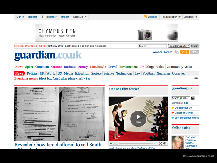
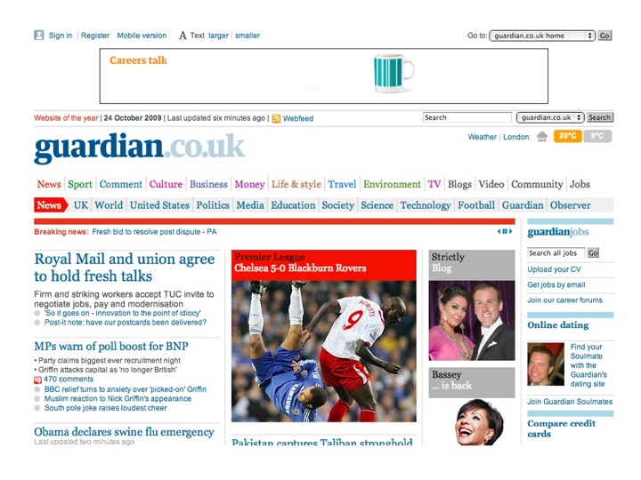
The Guardian Newspaper website provides a handy text resize widget on their site.

Now yes, text resize widgets are controversial in that they only help the user on that particular site, but if the user doesn't know how to change their browser settings, surely a text resize widget on each website is better than nothing?

Equivalent Experience

Note that I explicitly don't mean the SAME experience.

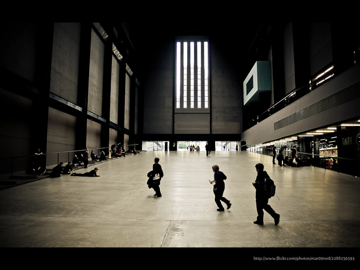
I used to think that Tate Modern was a pointless waste of time, then I watched a programme featuring a colleague. He explained why it was his favourite gallery and led a tour of some of his favourite works. Nothing extraordinary, right? Except he is registered blind and has very little useful vision. His experience wasn't and isn't the same as those who view the artworks with their eyes, but that doesn't make it less of an experience. It made me feel a little ashamed that I hadn't given the works the attention they deserve and that I'd been so narrow minded about the ways that people can experience art.

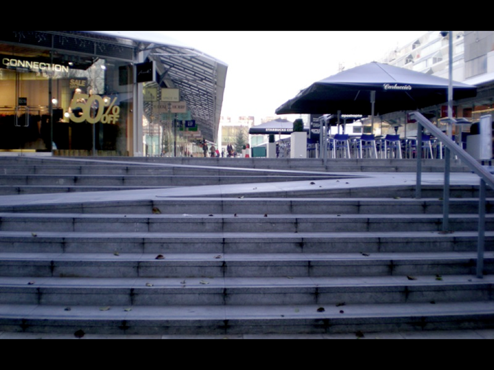
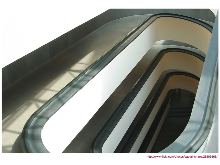
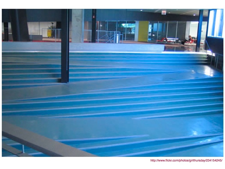
I worked near the Brunswick Shopping Centre at Russell Square in London for several years, and during that time it was renovated from, frankly, a shit-tip into a swanky upmarket shopping centre. When it renovated, there were a number of nice features included by the architects, including one I didn't even notice until I was doing some internet research for a previous talk on making accessibility sexy.

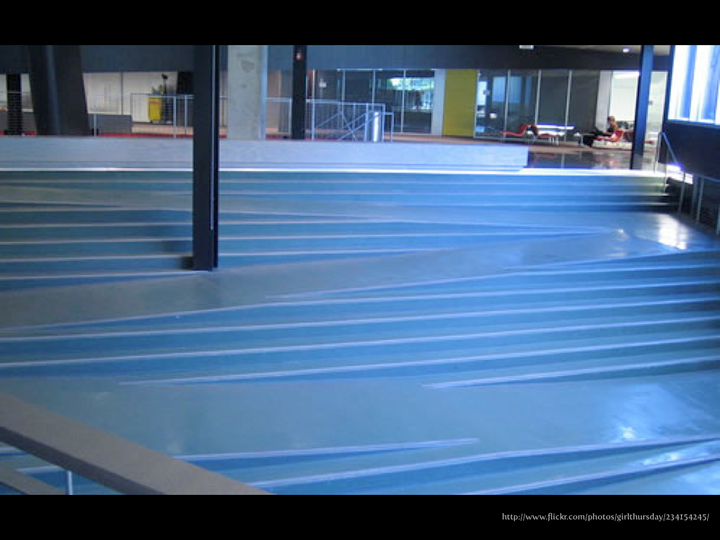
I found a picture of some steps with an integrated ramp and thought it was a genius idea, grabbed the photo, used it in my presentation and didn't think any more of it.

Until a couple of days later when I went back to the Brunswick Shopping Centre and suddenly it struck me.

I'd been using those stairs all along and hadn't noticed.

For MONTHS.

They just worked. For everyone. No signposted and segregated wheelchair ramp. Just something beautifully simple that everyone could use.

Sure, the experience of going down a ramp in a wheelchair is different to that of walking down with (or without) a pushchair is different to walking down steps, but the thing is that each experience is good. They're equivalent.

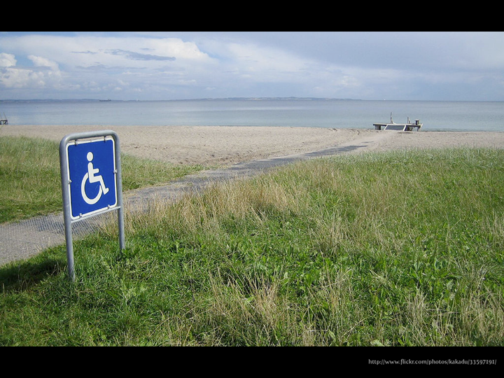
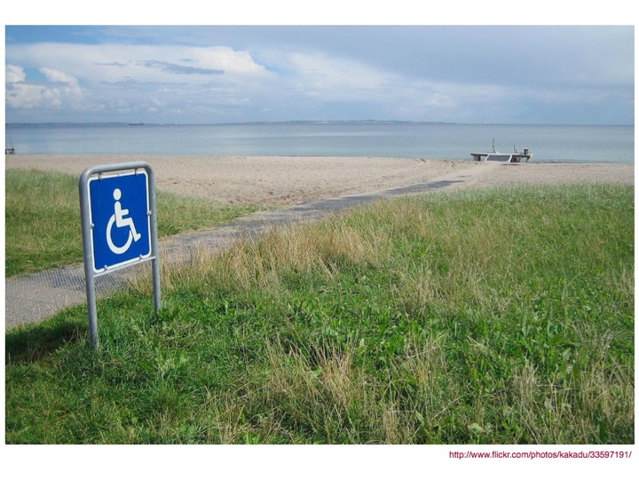
It can be tough to think of how to provide an equivalent experience in some cases, but a bit of creative thinking can result in an neat solution, like plastic mesh matting that allows a wheelchair user to get access to the beach and the sea, just like everyone else.

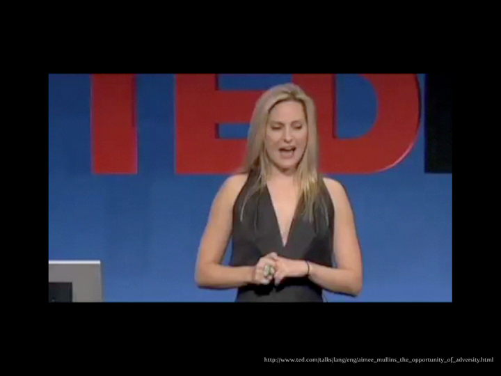
Here's Aimee Mullins again. The bit I showed in the talk starts at 4.39 and stops 6.09. You can read the transcript of that bit below the video.

I had to do what seemed like innumerable repetitions of exercises with these thick, elastic bands -- different colors -- you know, to help build up my leg muscles. And I hated these bands more than anything. I hated them, had names for them. I hated them. And, you know, I was already bargaining, as a five year-old child, with Dr. P to try to get out of doing these exercises, unsuccessfully, of course. And, one day, he came in to my session -- exhaustive and unforgiving, these sessions -- and he said to me, "Wow. Aimee, you are such a strong, powerful little girl, I think you're going to break one of those bands. When you do break it, I'm going to give you a hundred bucks."

Now, of course, this was a simple ploy on Dr. P's part to get me to do the exercises I didn't want to do before the prospect of being the richest five year-old in the second floor ward, but what he effectively did for me was reshape an awful daily occurrence into a new and promising experience for me. And I have to wonder today, to what extent his vision, and his declaration of me as a strong and powerful little girl, shaped my own view of myself as an inherently strong, powerful and athletic person well into the future.

Changing the experience can change someone's life. You could make it possible for someone to do something, by themselves and without any help, for the first time in their lives. Travel. Online banking. Shopping. Finding a partner. Whatever.

RNIB ran a series of awards called "Simply The Best" a few years ago, and one year, they decided to have a best website category because surely, any website voted the best by blind and partially sighted people would be accessible, right? Wrong. The most voted for websites were Amazon and Play.com, neither of whom were (either at the time or right now) in anyone's top 10 for accessibility. What they did have, however, was a compelling reason to use the site and as a result, people developed coping strategies. One colleague I talked to would have to spend, he estimated, around 24 hours of time figuring out what had changed every time Amazon changed their site.

That's outrageous. Don't get me wrong, it's testament to how a compelling offering will motivate users, but it just shouldn't be so difficult to spend money online.

I know some of this stuff is hard, but if it was easy, we, as designers and developers wouldn't find it nearly so satisfying to solve the problems. It's what motivates me to keep going, and is what motivated me to go and work on designing software for Investment Banks, one of the most challenging office-based work environments I can imagine.

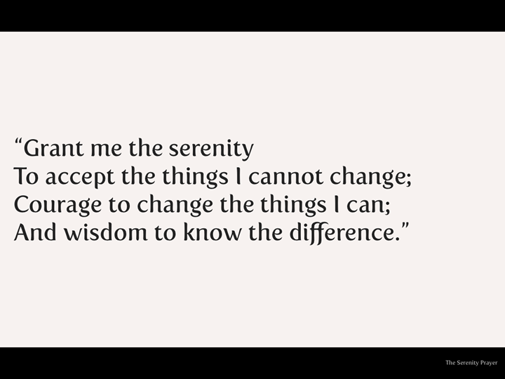
The Serenity Prayer (often used by Alcoholics Anonymous says:

Grant me the serenity To accept the things I cannot change; Courage to change the things I can; And wisdom to know the difference.

It's not easy, and we won't always solve the problems first time we try, but if we change the things we can and keep working on the things we can't change right now, we can change the world.

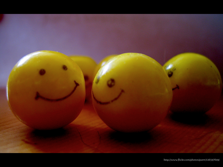
At the end of the day, we're empathic people - if what we does makes people happy, then we're happy.

So don't worry about accessibility.

Do what you do, to the best of your ability (and ask for help if you think you're out of your depth) and Be Happy.

Thank you.

Spaz is an unacceptable term

Khoi Vinh blogged a few gripes about the iPad this morning. So far, so what? A blogger who likes Apple gear blogs about his use of Apple gear. Who cares? I probably wouldn’t have, were it not for the last sentence of the following paragraph (reproduced in its entirety to give context):

Among features that the iPad does share with the iPhone, the ability to undo actions seems more rote than useful. As a gesture to invoke the Undo command, shaking a handheld device the size of an iPhone is clever and workable. Shaking a much larger device like the iPad is awkward at best and violates one infrequently violated but nevertheless important law of good user interface design: don’t force the user to look like a spaz in order to use any given feature.

Now, I’m aware that the US and the UK are divided by a common language, and that the term “spaz” is (or so I’m informed) less offensive in the US than the UK, but it still brought me up short. So I decided to check it out.

The Merriam Webster dictionary includes the following in its definition of “spaz”:

Etymology: by shortening & alteration from spastic slang : one who is inept : klutz

and from the definition of it’s longer form “spastic”:

1 a : of, relating to, characterized by, or affected with or as if with spasm [a spastic patient] b : characterized by hypertonic muscles [spastic cerebral palsy]

Whereas the Oxford English Dictionary includes the following in its definition of “spastic”:

adjective 1 relating to or affected by muscle spasm relating to or denoting a form of muscular weakness (spastic paralysis) typical of cerebral palsy, caused by damage to the brain or spinal cord and involving reflex resistance to passive movement of the limbs and difficulty in initiating and controlling muscular movement (of a person) having cerebral palsy 2 informal , offensive incompetent or uncoordinated

which certainly seems to support the theory, at least partially.

The thing is though, it was written on the (global) internet, by someone with a global profile and readership. Which is only the first part of the issue.

Saying what you mean, and meaning what you say

By choosing that particular word, the intent of the sentence changes from urging those in charge of implementing features to avoid making it awkward or uncomfortable to use said features to not making the user look silly or stupid. By equating spasticism with looking stupid it not only perpetuates the stereotype that those with physical disabilities are automatically lacking in intelligence, but puts a clear separation between those with and without a physical disability of that type, something which the individual has no more control over than the colour of their skin or eyes and seems to indicate that they are less.

Now, I really don’t think that Khoi would be so blunt as to say publicly that he thinks that those with physical disabilities are somehow less than he is (or look stupid) because of their condition (regardless of whether he actually thinks that or not), but that’s how it comes across.

Knowing your audience

In the time it's taken me to do some work and find a few minutes to write this post, a few comments were left that resulted in Khoi revising his original post.

Mei (no link) had the following to say:

I need to point out to you that your use of the word spaz ( presumably, an abbreviated form of or derived from ‘spastic’) may not go down too well with your readership in the UK where people are terribly PC…or at least some quarter are. Just so you know.

which was closely followed by Netscape (no link either) saying:

Yeah “spaz” is definitely not a cool thing to say in England.

Which, unfortunately, makes it seem like it's just oversensitivity from a small group of people, and therefore not to be worried about, an impression borne out by the revised sentence (emphasis mine):

don’t force the user to look like a fool [original euphemism deleted in deference to British sensitivities] in order to use any given feature.

I'd been pretty prepared to give Khoi the benefit of the doubt until I saw his response:

Mei: Thanks for pointing that out and my apologies to U.K. readers for inadvertently using an offensive term. I’ve altered it in the text above. Too bad, I was mildly proud of that joke even though it’s probably not that politically correct here in the States either.

It’s not acceptable anywhere, these days, to consider someone to be “less” because of the colour of their skin, so why is it acceptable to use someone’s other physical characteristics as a form of insult?

It's not political correctness gone mad.

It's a fundamental issue about how someone in a position to design interfaces views the potential users of those interfaces. If we categorise people with disabilities into a "them" category that's separate from "us" (either consciously or unconsciously), we do their needs a massive disservice. More than that, if someone of Khoi's stature in the community gives the impression that it's ok to do so, it just perpetuates the problem and prevents us from moving on to the place where we really should be.

Leading and following

Rather than being angry, I’m more just disappointed that someone with the reach that he has would use such a term without thinking about how it would be received by the totality of his audience (and then compound that error by responding in the way that he has).

It’s relatively easy to build up a reasonable sized audience and by extension, a reasonable influence, but as influence grows, so does the responsibility of that person to use that influence in a good way. We do ourselves a disservice as an industry if we don’t, as we become more successful and knowledgeable, try to share the best of that knowledge and understanding of the field that we are in with those who are still learning.

Just because we can blog quickly and without great thought doesn't mean that we should. It may take longer, or sometimes mean we don't blog at all, but it's really important that we include taking such care as the part of the cost of doing business.

Please review ATAG2.0

I'm part of the W3C's Web Accessibility Initiative (WAI) Authoring Tools Accessibility Guidelines (ATAG) working group (phew, that's a mouthful) and during the week, we published a new working draft of the new guidlines (ATAG2.0) along with a new "Implementing ATAG 2.0" guide. The official call for comments sent to the WAI Interest Group (IG) went like so:

Dear WAI Interest Group Participants,

The Authoring Tool Accessibility Guidelines Working Group invites you to comment on the updated Authoring Tool Accessibility Guidelines (ATAG) 2.0 Working Draft published 29 October 2009 at: http://www.w3.org/TR/ATAG20/

The draft integrates revisions in response to the comments of the 21 May draft as well as a substantially revised document, Implementing ATAG 2.0 that replaces Techniques for ATAG 2.0. In this draft, the Working Group made the following substantial changes: * Revised how authoring tools should support authors in making choices that improve accessibility. * Revised the former Techniques document to better serve developers, and changed the title to: Implementing ATAG 2.0.

Specific changes and questions for feedback are listed in the Status section: http://www.w3.org/TR/ATAG20/#status

ATAG defines how authoring tools should help Web developers produce Web content that is accessible and conforms to Web Content Accessibility Guidelines (WCAG) 2.0. It also defines how to make authoring tools accessible so that people with disabilities can use the tools. ATAG is introduced in the ATAG Overview at: http://www.w3.org/WAI/intro/atag.php ATAG is part of a series of accessibility guidelines/standards developed by WAI, which are listed in WAI Guidelines and Techniques at: http://www.w3.org/WAI/guid-tech.html

WAI encourages you to review the update ATAG 2.0 documents and submit comments on any issues that you think could present a barrier to future adoption and implementation of ATAG 2.0. Please send comments to the publicly-archived list: public-atag2-comments@w3.org by 30 November 2009

For more information, see: * How WAI Develops Accessibility Guidelines through the W3C Process http://www.w3.org/WAI/intro/w3c-process * Authoring Tool Accessibility Guidelines Working Group (AUWG) http://www.w3.org/WAI/AU/

Please let us know if you have any questions. Thank you in advance for your comments.

Feel free to circulate this message to other lists; please avoid cross-postings where possible.

Regards, ~Shawn Henry and Judy Brewer, W3C WAI On behalf of: Jutta Treviranus, Chair of AUWG, and Director of the Assistive Technology Research Center, University of Toronto Jeanne Spellman, W3C Staff Contact for AUWG

If you're at all interested in accessibility (or even if you're not) and you build any kind of tool or application that can be used to create content, you really need to be having a read of these and making comments if there's anything you have an issue with. These guidelines are an important part of the process of ensuring that web content, applications and software are accessible, and present an incredible opportunity to really lead the field in best practice, especially for CMS vendors.

Expand the Awesome: Design for a Wider Audience

This is a text version (more or less) of the talk I gave at BarCampLondon 7, because I don't think the slides will be of use to anyone who wasn't there. It isn't exactly what I said, because that was then, this is now, the talk wasn't recorded and I can't remember exactly what words I used. There were 34 slides and I did the talk in around 20 minutes (although writing it up has taken exponentially longer, weirdly), so feel free to grab yourself a cup of tea (or other beverage of choice) before you start reading.

Expand the Awesome: Design for a wider audience title slide

I started off doing the time-honoured "show of hands" routine, asking first designers and then developers to raise their hands. I was a little surprised that the room seemed to be mostly developers.

Jeremy Keith's @media 2007 slide which uses the term AJAX and shows it to mean 'Accessibility Just Ain't eXciting'

I then asked the room how many people agreed with the sentiment of "Accessibility Just Ain't eXciting", and after a slightly awkward moment where people looked at each other as if to say "can we admit this?", several people nodded in agreement.

Now, I don't believe that Jeremy really thinks accessibility isn't exciting because we've had conversations about it over the years I've known him, and I know that he was being very tongue in cheek with this slide, but I took this particular photo of his slide because I sat in the audience when this slide came up and was aware of several hundred people exhaling in relief and (some audibly, some not) saying "Yeaaaahhhhh…" as though they'd at last been given permission to admit that they really didn't like accessibility and found it boring.

I know that wasn't what he was going for, but one thing I've found over the years I've been talking about accessibility is that there are a lot of people who feel uncomfortable when thinking/talking about accessibility, and for whatever reason, don't want to think/do anything about accessibility. In essence, they're looking for someone to come along, pat them on the head and say "You've done enough accessibility, you can stop now" rather than "That's a good start, now how about this…?". The result is that they will hear what they want to hear, rather than what was explicitly being said.

A really good example of that is what happened in the aftermath of Joe Clarke's talk on "When accessibility is not your problem" at the same conference. A number of us were (rightly, as it turned out) concerned that the word "When" would be ignored by some of the audience, who would feel like they could stop doing accessibility now, because Joe said so.

It's a shame, because I genuinely believe that not only is accessibility and inclusive design a fascinating subject, but a real opportunity for designers to show their talent and creativity.

An assortment of cruches and walking sticks'

Then again, it's really difficult to get into that creative and excited space when the kinds of items that are associated with accessibility are ugly, boring and kind of scary devices, like crutches, wheelchairs and the like, which is why I love a quote I found from Helen Keller.

Helen Keller quote on suffering and overcoming'

Although the world is full of suffering, it is also full of overcoming it.

The thing about disability is that although it can be an awful thing, it's not like people with disabilities sit around all day every day and think about how terrible their life is. If you've just experienced something which has changed your abilities (for example, being confined to a wheelchair, or losing your hearing), then yes, for a while you'll spend some time thinking about the extra limitations that have now been placed on you, but there comes a point where you just have to get on with life.

You adapt, adjust and overcome.

Knitted walking stick cosies

Like the people who knitted walking stick cosies, to cheer up ugly walking sticks.

Aimee Mullins modelling for a fashion line, showing her prosthetic legs'

I first heard about Aimee Mullins from a TED talk, where she talked about her 12 pairs of legs. Go watch the video before continuing to read. I don't mind. In fact, I'd actively encourage it. She's an amazing woman. Come back here after though.

A few of Aimee Mullins' prosthetic legs, including some stunningly beautiful carved wooden legs

What I found most interesting about her is the notion that the goal for assistive devices or prosthetics should not be merely to replicate "normality", but instead to enhance and augment. Why should people who have a disability always be considered to be lacking in some way?

Why can't more design for specific needs be more integrated with design for "normality"? When it's done well, it can enhance the item, rather than detract from it (which is a common fear amongst designers who are asked to consider the needs of people with disabilities in their work).

L'Occitane products with braille as part of the labels

Braille on wine bottle label

Having Braille on the labels of L'Occitane products and bottles of wine doesn't prevent someone who can't read Braille from reading the text that is also there. It also doesn't (in my opinion) make it look any less aesthetically pleasing. In fact, I think it adds to it (and I'm quite sure I'm not the only one. I've also seen lots of people exclaim over Braille on product labels in shops).

Playboy and Reader's Digest Braille magazines

Although it might seem quite difficult to make some items accessible, or available in other formats, with a bit of thought, anything (pretty much) is possible. I still remember my delight when I found out about Braille Playboy early in my career at RNIB.

(as a side note, in searching for a picture of Braille Playboy, I found a great blog post entitled Playboy. In Braille., which is hilarious and well worth a read, particularly for the captions on the images. It makes me laugh just thinking about it.)

A wheelchair ramp on a beach in Australia

It's truly amazing what can be done with a bit of thought and effort. I would never have thought I'd ever see a wheelchair ramp on a beach, but I was delighted to find a picture of one. How wonderful that people in wheelchairs can experience the sea and sand (and attendant joys and nuisances of those things in combination with skin) independently, without having to rely on being carried, or giving up at the thought of how difficult it might be.

Vatican wheelchair ramp

Similarly, it's amazing how beautiful these things can be. I love this photo of a ramp in the Vatican. I think it's a thing of architectural beauty, and I'm glad that they chose to make a feature of it rather than hide it away or install a lift. Now everyone can enjoy it, not just those in wheelchairs and their carers.

Which leads me to the concept of integration. All too often accessibility is tacked on at the end, not integral to the design, and that leads to ugliness, awkwardness and bad design.

Wheelchair ramp integrated with stairs in the USA

When searching flickr for photos of good examples of accessible design for a previous presentation, I found a picture of a ramp that had been integrated into a flight of steps. I thought it was a genius idea. Those who could use the steps could continue to use them, but those who needed the ramp didn't have to go out of their way (or get out of the way of the step users). Fantastic!

Brunswick Centre Stairs/Ramp, face on

I was still quite excited about this find the next day when I was at work, and when I went out for lunch at the nearby Brunswick centre, as I had done many times before, I had a sudden realisation.

I'd been using something very similar. Pretty much every day. For months.

Without realising it.

The integration was so smooth that it just worked. For everyone. Wheelchair users. "Normal" people. Families with pushchairs. Elderly people with (or without) walking sticks.

It just worked.

Brunswick Centre Stairs/Ramp, side view

Even better, it didn't look ugly either.

There was no "Disabled users go here" segregation.

RIBA stairs with ramp

A post on Enabled by Design recently showcased the steps outside RIBA, another lovely example of what can be done when accessibility is integrated into the design process.

Tactile paving in Japan, leading pedestrians around manhole covers

I also love this beautiful example from Japan of using tactile paving to guide people with sight problems around potential obstacles on the ground. In this case, pedestrians can, without any irony, follow the yellow brick road and in the process, avoid (in this case) potentially falling down (or tripping on) a manhole cover.

Bus stop pavement ramp in Bristol

When I was in Bristol recently I had cause to use the local bus service, and it was only after three or so days of using it that I realised why the buses stopped in particular places.

At pretty much every bus stop I saw, there was a ramp built into the pavement, making it easier to get on and off the bus for everyone, never mind those with pushchairs or wheelchairs.

The ramps weren't an eyesore as they were built as part of the pavement, and they didn't stop anyone from using the pavement either.

A great example of design for a specific need that has wider benefits.

Oxo Good Grips Swivel Peeler

I love the OXO Good Grips range of kitchen tools.

The inspiration might have come from a wish to alleviate the discomfort of arthritis, but the products aren't marketed as being for disabled people, or even to alleviate disability problems.

OXO Good Grips case study from the Design Council

Oxo Good Grips Swivel Peeler marketing copy

The OXO GOOD GRIPS Swivel Peeler is simply the best peeler you will ever try! The sharp, stainless steel blade glides through even the toughest fruit and vegetable skins with ease. The soft, comfortable handle cushions your hand as you peel, and is non-slip, even when your hands are wet.

Nowhere in the marketing copy does it mention the need to have a problem to buy or use the product. Instead it focuses on the benefits to the end user.

Carsonified Events Page

It's not just the built environment where this integration can take place. It can (and should) be implemented online.

I probably wouldn't go as far as to claim that the Carsonified Events page is the ultimate in accessible design, but it was the first seriously high profile site aimed at the design community that I've seen implement a visible Skip link.

It doesn't get in the way for those who don't need it, but could be a real boost for people who can see just fine and can't use a mouse, enabling them to jump over any navigation links.

Guardian Home Page

The Guardian website has a really nicely implemented text resize widget. Clearly visible, and available to any and all who might need it. Yes, the use of text resize widgets is still controversial in the web accessibility community, but it can be a useful usability aid. Not everyone needs to use it, but equally it doesn't harm anyone else's experience by being there.

Legal & General Home Page

Which brings me on to the Legal & General website. It isn't boring and ugly, the all too often expected hallmark of accessible/inclusive design.

It's no longer news in the accessibility community, but it remains the best example of a solid business case for including accessibility as part of the design process.

Just a snapshot of some of the figures from Mike Davies' Presentation to the London Web Standards Group meeting.

Legal & General Home Business Case for Accessibility

  • 50% increase in search engine traffic
  • immediate 95% increase in requests for quotes
  • 90% increase in completed applications
  • 300% increase in take up for some products
  • conversion rates doubled for the most important revenue generators
  • 450% increase in earnings in the five days following the launch of a redesigned product
  • longer term 135% increase in completed applications
  • return on investment in five months

In the current financial climate, I honestly can't believe that any business can afford to ignore figures like these. The increase in sales as a result of making the site accessible didn't, for the most part, come from people with disabilities. It came from "normal" people. Making the site easier to use for people with disabilities made it easier to use for everyone, and as a result, more people bought the products.

If you're designing, building, making, selling anything, why wouldn't you want even more people to find it, read it, use it, buy it, think it's awesome?

Inclusive Design != (does not equal) Ugly

As I hope I've shown, Inclusive Design doesn't have to be ugly. It can be a thing of beauty that's a delight to use, whoever happens to be using it.

Accessibility = Extreme Usability (kind of)

It's easy to say, but I do think that Accessibility is kind of like an extreme form of Usability. If a product is easy to use by people with impairments, it is highly likely to be easier to use by people who don't have impairments.

Ok. How?

It's no use me saying that people should design sites (or whatever) for a wider audience without giving some hints and tips on how this can be done.

For the purposes of this, I'm talking about websites or computer interfaces, but a lot of this can be applied to other things.

It's also necessarily brief and high level. For more detail, you could have a look at Designing Accessibility Into Themes, which I wrote earlier this year for the Drupal 7 User Experience project or contact me for some training or consultancy.

Good typography

If you want people to read your content/buy your stuff, you need to make sure they actually can. Good typography is incredibly important. Choose an appropriate typeface, ensure that the text is of a decent size (and can be resized), ensure that there's sufficient contrast between the text and the background colour and a decent amount of space between lines (but not too much).

Pretty

Make it pretty. Don't be afraid of using colour and images to make things look better. Pretty things make people happy. Happy people are happier, and often buy more stuff.

Just make sure that while you're making it pretty, you're not making it more difficult to read and/or use.

Clear and simple language

Use clear and simple language (where appropriate). The easier you can make it for people to understand what you're offering and what benefit it can bring to them, the better. Obviously, this doesn't apply to scientific texts or suchlike, but if you're selling a product or a service, making it easier to understand can only broaden your audience and by extension your client/user base.

Instructions before tasks, not after

One of my pet hates with form design is this proto-convention which has developed which places the form label above the input, and any help text after or below the input.

It just doesn't make sense to give the user the information they need after they need it. If you need a user to take a specific action, or give you a bit of information in a specific format, tell them before they enter it.

I know it might seem obvious, but it's still far from the convention, and I'd like to see that change.

Keyboard only

Make sure your interface works with keyboard only as well as with mouse. In fact, unplug your mouse (and/or disable your trackpad) and spend some time using the keyboard only.

It's not the be-all and end-all, but if your site works without needing to use a mouse, you're a good way towards it being more accessible and easier to use (and I can pretty much guarantee that you'll find at least one thing that will make you rethink your interface).

Progressive enhancement

Design a really good base interface. Make sure that the user experience for people who don't have or can't use a mouse, javascript whizzbang whatevers and all the rest of it is a good one, then build on that rather than try and retrofit functionality based on all the shiny and whizzy interface bits you've designed. It'll be far more difficult and it's more likely to lead to compromises in the visual design.

Anyone using the base interface shouldn't feel like they're missing out on something.

It's far easier to start from a good solid base and then iterate, adding nice functionality and interactivity along the way (making sure that whatever you're doing isn't making whatever it is more difficult to use).

For example, if you're building a user interface which displays styled tooltips when you hover your mouse over a particular element, think how those elements could be incorporated into the design if you don't have javascript/whatever available. Are they important or are they nice to have? If they are important, then design them into the base interface. If they're not important, it's fine to have them not appear. It's also really important to duplicate any hover-based functionality so that it appears when the item is given focus so people who can't use a mouse can still use it.

This isn't just for people with disabilities - iPhone (for example) users can't make content appear on hover when they're looking at a website in mobile Safari.

Thank you

One final story. A few years ago RNIB held a series of awards, one of which was for Best Website. It was to be nominated for and voted on by blind and partially sighted people. We thought that it might throw up some really fantastic accessible websites that we didn't know about, and allow us to use them as examples of how great these could be.

We were wrong.

The sites that were most nominated were sites like play.com and Amazon. This was before the lawsuit requiring Amazon to make their site more accessible to blind and partially sighted people, when most of the images on the site didn't even have alt text. Not exactly a shining example of accessibility. What it had going for it was compelling content. People wanted to use the site so much that they'd found or developed coping strategies that would enable them to use the site.

Coping strategies are all well and good, but we don't all offer something as compelling as cheap books and CDs, and users may not put the effort in to find workarounds for accessibility or usability barriers. More often, they'll go somewhere else if they can.

At the end of the day, inclusive design is a real opportunity to bring the awesome that is your creation to a wider audience, and really, why wouldn't you want even more people to love/read/buy your stuff?

If you're interested in reading a bit more about inclusive design, I can heartily recommend reading Design Meets Disability by Graham Pullin

If you've read this far, thank you. I could have gone the easy route of just throwing the presentation slides up on slideshare or recording a screencast, but neither of those felt like they would particularly capture the essence of what I was trying to convey with my talk. Hopefully, this does a good enough job.

Jump back to the top (without miles of scrolling)

About Accessibility Pages

A while ago, I asked a question about accessibility help pages on twitter, and even set up a poll, asking "Where on the page do you put your accessibility help link?". I gave four options, and the results were as follows:

  • At the top, in the first few tabs/links. 44% (35 votes)
  • At the bottom, in the last few tabs/links. 25% (20 votes)
  • What accessibility help link? 29% (23 votes)
  • Other 1% (1 votes)

I've been meaning to blog about it for ages, and was reminded about it again today, when I looked at three or four sites in a row which had accessibility help links as the very last link on the page.

I then posted to twitter that I:

would love to see stats for how many views accessibility statements/pages that are linked at the very end of page get, vs top of page.

I was really pleased when @AndyDBryant replied:

@pixeldiva If it can wait til tomorrow, I can dig out stats for my employer's site (accessibility link at bottom). What kind of time period?

I wasn't expecting any particular answers to my tweet, I was really just thinking out loud, but I really would love to know how many page views accessibility pages get, regardless of their positioning.

I have a few theories about them, but I'd like a bit more data before I expand on what they are, which is where you come in.

If you work on the web, have access to statistics and have an accessibility page, I would absolutely love it if you could give me the following info:

  1. Where on the page your accessibility page is.
  2. How many views your accessibility page has had in a given time period.
  3. How many views your home page has had in that time period.
  4. What that time period is.

If you can give me the name/url of the site that would be awesome, but if you can't for whatever reason, that's fine.

You can also use a fake name along with your comment if you feel the need, but I'd really appreciate it if you used a real email address (it'll only be seen by me, and I won't use it for evil, promise) so that I can contact you for further info (if you're happy for me to do that).

If you really feel uncomfortable posting stats publicly but still want to share, you can email me instead.

Thank you.

What's up with #missingbodybackgroundwatch

I wrote a post the other day sharing a tiny tip that makes testing websites easier (go read, it's short, I'll wait), and in that post, called out the first site that I found that had a missing body background colour. Since then, I've spotted a quite surprising number of sites that have the same affliction and have (mostly for my own edification, and with half a mind on a blog post further down the road) been posting each site to twitter using the hash tag #missingbodybackgroundwatch and today, a couple of people asked what it was all about.

So. A bit of explanation.

Working with a changed colour scheme was, for the most part, not a problem… unless the site in question had specified the text colour to be a similar shade grey (or anything else that was quite light) at which point the entire thing became almost entirely unreadable as the colour contrast all but disappeared. Doh!

A better example would be a site that specified black for its text and neglected to set white as the background colour. If anyone visits using a browser set to the default colour scheme (or using Windows or Mac default colour schemes) that'd be fine, but if, for example, someone was using a high contrast reverse colour scheme, the default browser background colour would more than likely wind up being black, combine that with black text, and it just doesn't work.

Since a picture is worth a thousand words, here are three screenshots that illustrate why it's a problem.

The site in question is the New Statesman (I can't remember why I was looking at it - probably followed a link from twitter).

New Statesman (Standard Browser Default Colour Scheme) Example 1: New Statesman viewed using the standard Firefox (cos that's what I use) default colour scheme. Looks fine, right?

New Statesman (Different Colour Scheme) Example 2: Viewed using a different background colour (to imitate a different colour scheme). I chose pale green because it illustrates my point better than grey. It doesn't look too good, but at least it's still readable.

New Statesman (High Contrast Reverse Colour Scheme) Example 3: Viewed as it would be if a user had chosen a high contrast reverse colour scheme. Some text is readable, but lots of it isn't (which is a bit of a problem for a newspaper/magazine site.

It's such a tiny thing, but the impact can be huge.

So, if you're going to specify a text colour, make sure you've specified an appropriate background colour too. That doesn't mean that you have to specify a background colour on every element. Provided that somewhere underneath your text you've specified a background colour that has sufficient contrast against the text colour, you can let the cascade do its thing.

Obviously, if you decide to change to using light text on a dark background in an area where the rest of the site is dark text on a light background then you'll need to specify both.

Oh, and make sure that wherever you use background images that you back them up with an appropriate background colour as well. Otherwise, all that lovely contrast disappears if, for any reason, images are not available.

I'm going to keep collecting sites with a missing body background colour, do a bit of research and write a post about it in a wee while, so in the meantime, if you feel like it, change your background to something else (in Firefox, you'll find it in Preferences, Content, Colours, then click on the box next to Background and just pick something else from the handily provided swatch) and if you spot any, it'd be ace if you'd post them to twitter using the #missingbodybackgroundwatch hash tag.

A tiny tip that makes testing websites easier

When I worked at RNIB, I changed my default desktop colour scheme because the default windows scheme gave me headaches and eye strain. The department of unintended consequences then stepped in and handed me a neat way to know whether a site was missing it's body background colour without having to check any code, because it changed the default browser background from white to muddy grey. Since moving to using a mac, I've grown used to the white default background in the browser, and this morning, had a moment of panic when I realised that I wasn't sure if I'd specified the background colour in the templates I'd built (and which were delivered to the client) last week.

I had, of course, but I realised in that moment that it'd have been much easier if I went into the settings and changed the background colour away from white (to grey, but you could choose whatever makes you happy), just to avoid that kind of panic in future. So that's what I did.

Disappointingly, the first site to fall at that particular hurdle was the Firefox default Google search home page.

Notes from Bristol Usability Group talk by Andrew Arch

I don't know whether it's just coincidence, but since I've been working in Bristol, there seem to have been quite a high proportion of geek events happening locally, which as well as being interesting, have given me the opportunity to meet some local folk. Last night was the turn of the Bristol Usability Group, which I was completely unaware of until Joe and Laura (separately) told me about it via twitter, correctly thinking that it'd be right up my street.

It was.

Last night's topic was Designing for Old(er) People and Andrew Arch, Web Accessibility and Ageing Specialist for the Web Accessibility Initiative: Ageing Education and Harmonisation Project (WAI-AGE) was presenting.

I've known Andrew for a few years now, since he worked for Vision Australia doing similar stuff to what we did at RNIB, and hadn't had a chance to speak to him in a long time, so quite apart from hearing his presentation, it was really good to get a chance to catch up with him. Especially since he was at the Standards.Next event I was at on Saturday but I didn't get a chance to talk to him then.

I took quite a few notes during Andrew's talk, because he gave a lot of information that I wasn't aware of, including lots of useful and interesting statistics, and assuming I can read my handwriting (not an absolute certainty, and the longer I get from having written them, the less likely it gets) I thought I'd transcribe (and share) what I wrote down.

It was an information packed presentation (and discussion afterwards) and I couldn't physically write any faster and so I know I missed some stuff, so any errors or omissions are mine alone.

Aging facts and figures

According to the UN, by 2050, more than 20% of the world's population will be over 60, however, some countries (such as Japan) have populations which are aging faster than others.

In the EU, it's estimated that by 2010 17% of the population will be over 65 and 5% will be over 80 years of age. By 2050 that number will rise to 29% over 65 and 12% over 80, which is a significant increase.

Age-related impairments

Audio

As we age, our hearing becomes less sensitive and we lose the ability to hear high pitched sounds and distinguish specific sounds if there is a lot of background noise.

Andrew gave figures of 47% of people aged 61-80 having some hearing loss which rose to 93% in users older than 81.

Vision

Perhaps the most obvious impairment as a result of aging. As we age we are less able to focus on near tasks, our colour perception and sensitivity decreases, as does our perception of contrast.

Most interesting to me was the prevalence non-correctable vision loss (that is, can't be corrected by wearing glasses or contact lenses). In people aged 65-74 the figure was 16%, rising to 19% of people aged 75-84 and 46% of over 85s.

Mobility

Quite apart from conditions such as Arthritis, as we age we lose some fine motor control, which makes it difficult to, for example, write or use a mouse easily.

Approximately 50% of the population over 65 have Arthritis and 20% have what's known as "Essential Tremor" (slight shaking, but not as serious as Parkinson's) compared to 4% of people over 85 having Parkinson's (a figure I thought would be higher).

Cognitive

As we age, we lose some of our short-term memory and concentration, as well as suffering from information overload and becoming easily distracted (although some would argue that that's already happening in younger generations due to things like twitter and facebook, but I digress… )

As far as conditions go, (only) 1.4% of people aged 65-59 have been diagnosed with Dementia, rising to 24% of people over 85. However 20% of people over 70 are considered to have a "Mild Cognitive Impairment" (memory loss, etc.).

Multiple Impairments

Although it'd be nice to only have one thing go downhill as we age, unfortunately, aging tends to have a cumulative effect and older people often have multiple impairments, although it's clear that most don't consider themselves to be "disabled" (and nor should they).

Opportunities

Being online opens up many opportunities to older people (and everyone, really), such as:

  • social interaction and communication
  • access to information
  • e-commerce (although older people are more cautious about security issues)
  • access and/or participation in civic activities
  • training
  • employment, research and workplace opportunities

Demographic percentages

In 2006, the percentage of people online among the different age groups were:

16-24: 83% 25-44: 79% 45-54: 68% 55-64: 52% 65+: 15%

In 2008, those figures had changed to the following:

16-24: 93% 25-44: 87% 45-54: 78% 55-64: 63% 65+: 26%

These figures came from the Office of National Statistics, and counted people who said they'd been online in the last three months as "being online".

Getting online

Owning a computer lowers the barrier to getting online (as opposed to using a shared machine or going to a library), but there does seem to be an increased fear of "breaking" it (where it might be the computer, the internet or the entire world).

That said, there seems to be a snowball effect where older users encourage each other to use computers and/or get online. Age Concern also offer training for computer skills training for older people.

The needs of older users

There's a big overlap with the needs identified and catered for by the WCAG guidelines, but studies done seem to have been done by people who didn't have much awareness of WCAG and haven't built on previous work done.

Some things to take into account when thinking about the needs of older users:

  • They consider themselves old (not disabled)
  • They don't want to appear different (so might not change settings or use assistive devices.
  • It can be difficult to implement coping strategies (because of the reason above, or because of lack of recall)
  • They may not be aware that the options are there (because they've been taught to use their computer by younger people who don't know the options are there either because they don't need them)
  • Access technology can be (is) difficult to use

Guidelines for designing for older people

In no particular order:

  • Ensure text is readable by choosing a decent font size (my recommendation: no less than 75% of default (or 12px)), ensuring good colour contrast and choosing appropriate colours (apparently flourescent colours appear blurry to older users)
  • Make sure links are easy to identify and behave predictably
  • Have clear and identifiable headings
  • Make it easy for users to orient themselves within the site
  • Provide clear and consistent navigation, and include breadcrumbs, search and a home button
  • Be consistent with layout
  • Avoid information overload
  • Avoid italics and underline (because it makes text more difficult to read)
  • Left justify text (rather than right or full)
  • Increase line spacing and margins
  • Simplify forms, provide clear guidance and error messages and make it easy for users to correct errors (as an interesting point, apparently the now conventional red asterisk is all but invisible to older users, so the recommendation is to use the word (required) instead)

WCAG2.0 and Older People

Andrew recommends looking beyond the sufficient techniques to the advisory techniques for WCAG guidelines, as many of these techniques are more usability focused than pure technical accessibility and may be of particular benefit to older users.

WAI-AGE Project Ongoing Work

  • Educational resources for industry (designers, developers, etc.)
  • Educational resources for users
  • Pursuing standards harmonisation (between Silver Surfer guidelines and WCAG, etc.)
  • Encouraging participation by older users in standards development

Interesting Points from the Group Discussion

There was a really interesting discussion after Andrew had finished his presentation, with several attendees sharing experiences they'd had of testing with older users (or grandparents).

Tips for Testing with Older Users

  • Individuals may find it awkward to do their thinking out loud and/or feel embarrassed about their ability (or lack thereof), but observing a group of users can bring valuable feedback as they'll help each other and talk amongst themselves
  • Be prepared to achieve less in more time than you think - older people often talk more and are more likely to read every word of the site before attempting a task
  • Be aware that concentration levels will drop off more quickly than with younger users
  • It might be more difficult to recruit and retain older participants for multiple test sessions across lengthy projects because "I might not be here" (now there's a cheerful thought)

Collected notes and observations

A site that was redesigned to suit the needs of older users was tested with younger users and when given the choice, the younger users preferred it.

A lot of older users have laptops, and as a result have more experience (and are therefore more comfortable) using a trackpad rather than a mouse.

Buying or owning a laptop increased the likelihood of frequent useage (more portable, easier to use from the sofa, easier to show stuff to other people, etc.).

Older people will join social networks like facebook to keep tabs on their younger relatives, but tend to watch rather than interact.

Older men seemed to use the internet less than women (possible connection to it being women who tend to communicate more than men?).

It was more difficult to recruit male participants for user testing.

I have more notes, but they're less than coherent in the light of day (err, night now) and that's probably more than enough to be getting on with.

Designing Accessibility Into Themes

I was delighted last month to spend a couple of days with Leisa Reichelt and Mark Boulton looking at the work they're doing for the d7ux project from an accessibility point of view. During that couple of days, we got to talking about how to make it easier for people who make Drupal themes to make them accessible, and we came up with the idea of writing a kind of hints and tips document that could be viewed online or downloaded and printed.

The resulting document - Designing Accessibility Into Themes - is now available from d7ux.org and I've been overwhelmed by the positive response it's received on twitter so far. I'm even more pleased that it's in the queue to be included in the Drupal Handbook.

It's not an exhaustive guide to everything you should do to make a website accessible, because that would take many, many more words, but I hope it strikes the right balance of information, pragmatism and tone and gives a good overview of the main things to keep in mind if you're designing a theme for any kind of content management system - not just Drupal.

If you've got any feedback on it, I'd love to hear it, and please feel free to pass it on to anyone who you think might find it useful.

Thought-provoking posts on Accessibility

There have been several really thought-provoking posts about accessibility made over the last week or so, and while I'm marshalling my thoughts (and the several thousand words I've written in response) into something coherent, I thought it'd be worth linking to them. Accessibility to the Face from Northtemple

Here’s my point–if your brother or sister had a disability, you would give a crap. But you don’t have to have a sibling in a wheelchair to genuinely care, even if it’s only in your work.

Empathy is what separates us from the rest of the animal kingdom. We have an ability to imagine things the way that others see them and how it makes them feel. We don’t even have to have a disability ourselves.

And from my perspective, accessibility is about giving a crap.

Accessibility is NOT a checklist.

Accessibility is about usability.

Accessibility is a paradigm shift.

Accessibility is a personal issue.

If you read none of the other links in this post, read this.

Commentary on Sign Language and Accessibility from The Deaf Perspective

Quid pro quo. The loose translation for the Latin expression is “you give me something, I give you something.” We give the world accessibility to our community, our language, and our unique perspective. In return, everybody understands more why accessibility is so important for everybody.

When is the Right Time for Accessibility from Derek's Box of Chocolates

Is it possible to include accessibility support “too early?” I’m not saying it should be an add-on at the end of the process/project/product development cycle, but I’m very seriously wondering what the optimal time for integrating an actual accessibility implementation is? Is it enough to keep accessibility architecture in mind from the beginning, but not implement right away? Should we get the basics right first, and then build in accessibility support based on that previously envisioned architecture after we know we have a viable product? We continue to say that accessibility should happen throughout rather than just at the end, but would it actually be better if we left it out, just for a little while, at the beginning?

Is Web Accessibility a Human Rights Issue? by Wendy Chisholm

It’s important for us to recognize each other’s concerns. On the one hand we have technologists who want to create things to help make the world better–help people communicate more richly and quickly, to create technologies for self-expression and commerce. Rock on. We want you to innovate because you’re changing the world. On the other hand we have people who want to use the technologies and to participate in society. When the technologists say, “Don’t make me think about accessibility, I want to be innovative.” The response from people with disabilities can be hostile because the message from the technologists is, “I do not value you enough to include you in my innovation.”